Enter password to view project
On-The-Spot Signing
On-The-Spot Signing enables users to capture legally valid signatures from physically present signatories directly within Lexagle without requiring the latter to create accounts. Users facilitate the signing process on their device while signatories provide their actual signatures, streamlining B2C contract execution and reducing operational friction for our clients.
Problem: The current signing workflow is too complex for simple, immediate signing. There is added friction in the signing process and potentially losing momentum in deal closure.
Switching accounts when accessing secure link → more steps for digital signing, which can be disruptive for on-site scenarios
Current state:
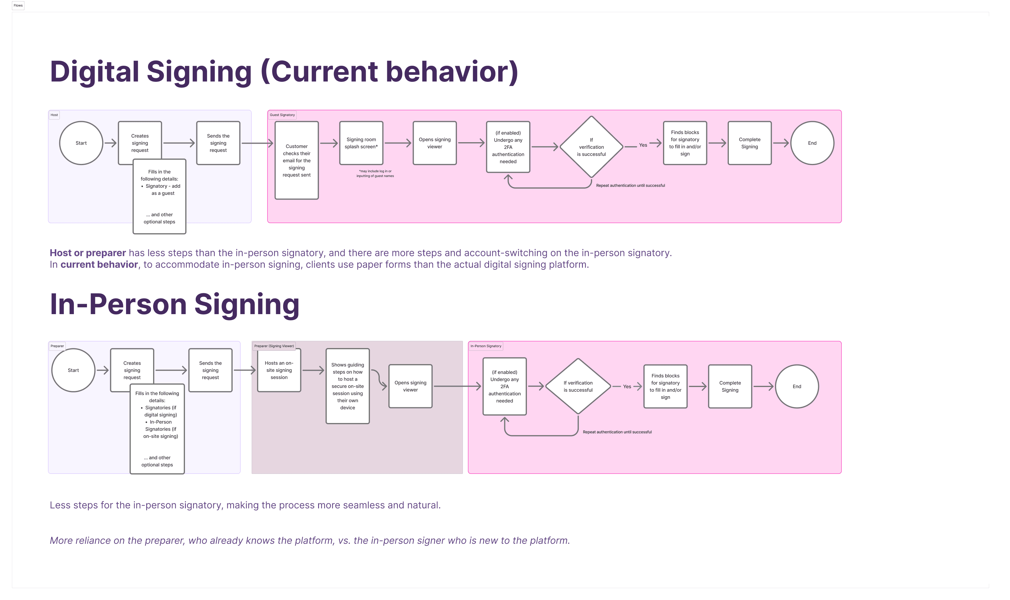
Clients often use paper-based signing, wherein they use printed form to fill out with the customer and then the customer will sign, and tablet signing, where they use the traditional way of using PDF viewers to fill out the form, and customer will sign on the tablet device.
Role
UX/Product Lead Designer
Role
UX/Product Lead Designer
Role
UX/Product Lead Designer
Other Collaborators
1 PO, 1 UXR, 1 UI Designer
Other Collaborators
1 PO, 1 UXR, 1 UI Designer
Other Collaborators
1 PO, 1 UXR, 1 UI Designer
Company
Lexagle Pte. Ltd.
Company
Lexagle Pte. Ltd.
Company
Lexagle Pte. Ltd.
Timeline
6 Weeks (2 Sprints)
Timeline
6 Weeks (2 Sprints)
Timeline
6 Weeks (2 Sprints)
Goal is to have a quick and seamless contract signing during in-person meetings, lessening steps and friction in the signing process
Design Principles:
My design principle on this feature is to be simple and focused.
Be simple to use for Non-Platform users — no relearning required; the point is to make signing easier similar to paper-based signing or their current workaround.
Allow users to focus on the important part — the signing process
User Understanding
Preparers / Facilitators
Acts as the host or facilitator of the signing process
They view signing as the critical moment to close the deal and generally, they want the customer to directly sign at the same device to ensure that the system recognise it.
“When I hand my device to the customer, I want to build trust and connection so that we can close the deal.”
“When closing the deal on-site, I want immediate confirmation of signature completion, so that I can activate next steps without waiting”
In-Person Signers
In-person Signatory
They expect that they don’t need to register anymore or access secure link via email, and they can just directly sign (similar to signing on paper but electronically) without additional steps.
“When I’m about to purchase a product or sign a contract, I want to complete it immediately without switching devices, so I can finish it quickly without any hassle”
“When signing on someone else’s device, I want confidence that the signature is secure and legally binding so that I don’t have to worry about my signature being compromised”
Design Solution
HMW remove unnecessary steps interrupting signing, so customers can sign as simply as on paper?
HMW make in-person signing as frictionless, quick and easy as possible for customers?
HMW enable AMs to seamlessly capture signatures in-person and immediately confirm completion, so deals close in the moment?
Proposed Solution
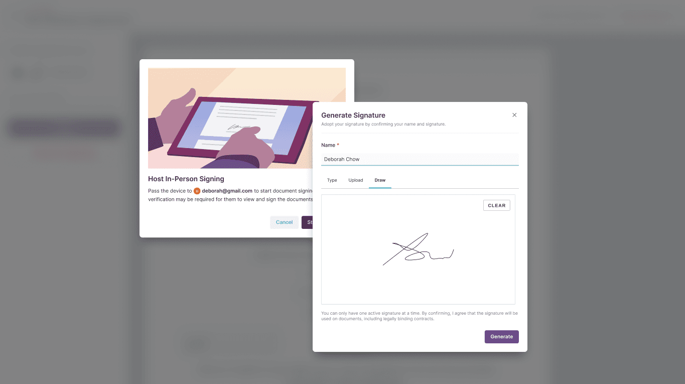
Since in-person signing in nature generally involves a single device where 2 users are involved, I decided to introduce a guiding modal for preparers acting as on-site facilitators. Once they clicked "Start Session", they should have handed over the device to the respective in-person signer. Depending on the organisation settings, an additional verification step will be needed for the signatory to fill in.

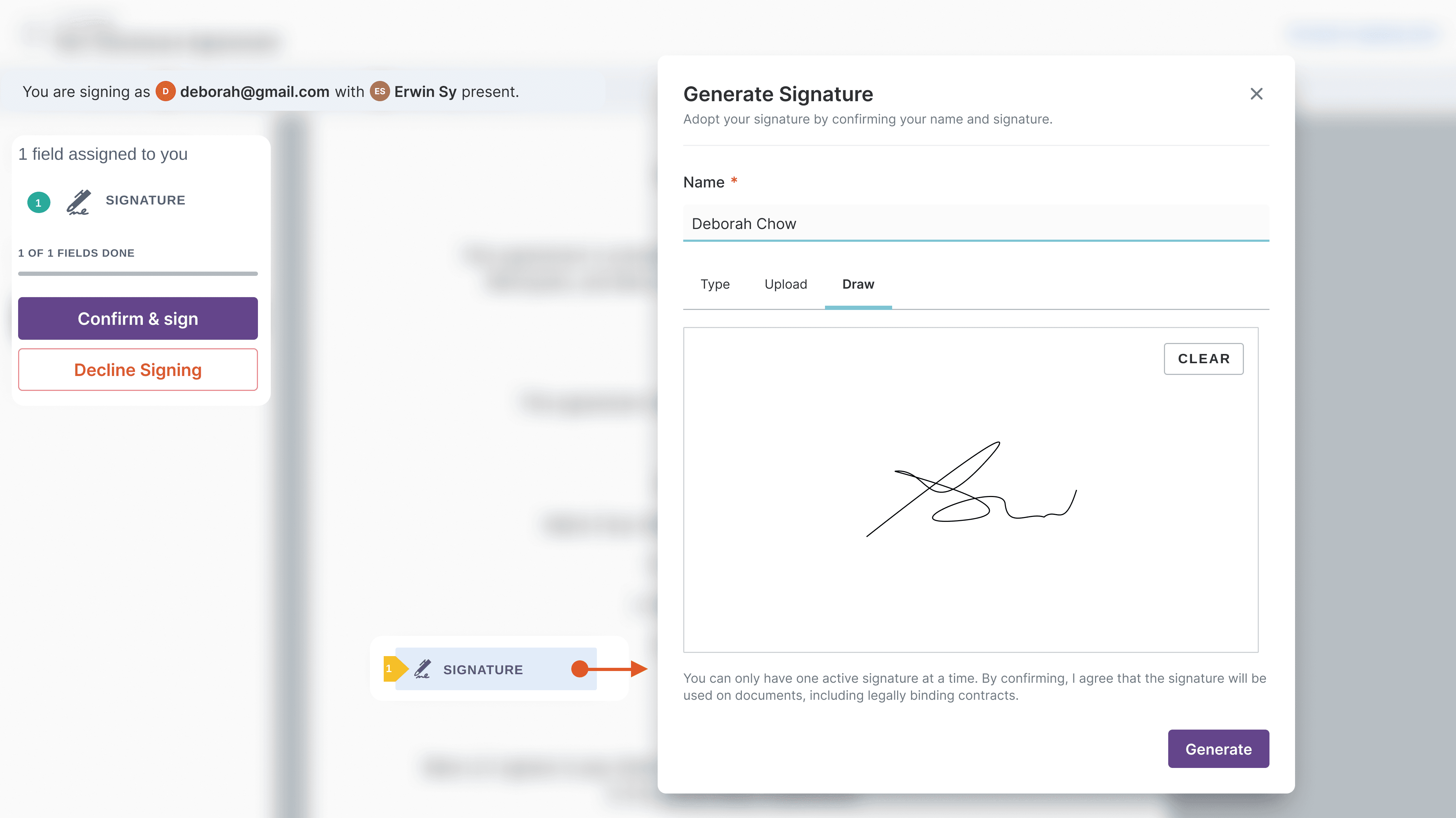
Now, in-person signer is in the signing viewer. A banner will indicate that they are signing with the presence of the Preparer as the facilitator. Once they clicked the signatory block, they can choose to either type, upload, or draw their signatures in the modal. They can click "Generate" to adopt their respective signatures.
Once signing is finished, then a success modal will be shown to indicate the completion and in-person signers must return the device to the respective hosts.
Early Design Validation
Usability Testing
Moderated usability testing (tablet), task-based walkthroughs
4 participants
Users asked whether they were seeing the customer view or still AM view — how do we make this visually apparent? wondering if the ‘Start Session’ isn’t enough? to explore
Resolution: Added an illustration to make it more apparent that handover is happening after the 'Start Session'.
Reconsider auto-selects defaults for organisation with In-Person Signing toggled on — on Roles popover, since Signatory is automatically selected as default.
Resolution: No auto-selecting default to Signatory. Empty state will be added to Roles field now to introduce 'In-Person Signatory' as a whole.
User mentioned since In-Person Signing is selected, draw should be prioritized instead of text (since they will be using an external device to sign
Resolution: Draw will now be on the first tab and selected as default for in-person signing personas.
Challenges Addressed
Less steps and account-switching on preparer and signatories
Impact: Consistency & Confidence
Easier to use across different signing modes, increase of signing adoption rates, more confidence in the signing process
Only showing what’s relevant to the signatory who does not have any platform background
Project Learnings
The difference between "understood" and "trusted"
Even when users know what they are being asked to do, hesitation can arise if they don’t trust the device, aren’t confident the signature will be legally valid, or fear making a mistake in a public setting. This reveals how critical microcopy, real-time feedback, and clear visual cues are in building confidence within seconds—trust must be designed, not assumed.
The importance of guidance over exploration
On-the-spot users don’t browse or experiment; they follow instructions. Effective UX in this context is instructional rather than discoverable, relying on clear prompts, a linear step-by-step flow, and an unmistakable confirmation that the task is complete. Any ambiguity slows users down and increases anxiety in an already pressured environment.
Error recovery matters more than prevention
Mistakes are inevitable, and when they happen, redoing steps can feel costly and embarrassing, with confusion escalating quickly. The strongest designs anticipate this reality by making recovery paths calm, fast, and nearly invisible—allowing users to correct issues without drawing attention or disrupting the flow.

Enter password to view project
On-The-Spot Signing
On-The-Spot Signing enables users to capture legally valid signatures from physically present signatories directly within Lexagle without requiring the latter to create accounts. Users facilitate the signing process on their device while signatories provide their actual signatures, streamlining B2C contract execution and reducing operational friction for our clients.
Problem: The current signing workflow is too complex for simple, immediate signing. There is added friction in the signing process and potentially losing momentum in deal closure.
Switching accounts when accessing secure link → more steps for digital signing, which can be disruptive for on-site scenarios
Current state:
Clients often use paper-based signing, wherein they use printed form to fill out with the customer and then the customer will sign, and tablet signing, where they use the traditional way of using PDF viewers to fill out the form, and customer will sign on the tablet device.
Role
UX/Product Lead Designer
Role
UX/Product Lead Designer
Role
UX/Product Lead Designer
Other Collaborators
1 PO, 1 UXR, 1 UI Designer
Other Collaborators
1 PO, 1 UXR, 1 UI Designer
Other Collaborators
1 PO, 1 UXR, 1 UI Designer
Company
Lexagle Pte. Ltd.
Company
Lexagle Pte. Ltd.
Company
Lexagle Pte. Ltd.
Timeline
6 Weeks (2 Sprints)
Timeline
6 Weeks (2 Sprints)
Timeline
6 Weeks (2 Sprints)
Goal is to have a quick and seamless contract signing during in-person meetings, lessening steps and friction in the signing process
Design Principles:
My design principle on this feature is to be simple and focused.
Be simple to use for Non-Platform users — no relearning required; the point is to make signing easier similar to paper-based signing or their current workaround.
Allow users to focus on the important part — the signing process
User Understanding
Preparers / Facilitators
Acts as the host or facilitator of the signing process
They view signing as the critical moment to close the deal and generally, they want the customer to directly sign at the same device to ensure that the system recognise it.
“When I hand my device to the customer, I want to build trust and connection so that we can close the deal.”
“When closing the deal on-site, I want immediate confirmation of signature completion, so that I can activate next steps without waiting”
In-Person Signers
In-person Signatory
They expect that they don’t need to register anymore or access secure link via email, and they can just directly sign (similar to signing on paper but electronically) without additional steps.
“When I’m about to purchase a product or sign a contract, I want to complete it immediately without switching devices, so I can finish it quickly without any hassle”
“When signing on someone else’s device, I want confidence that the signature is secure and legally binding so that I don’t have to worry about my signature being compromised”
Design Solution
HMW remove unnecessary steps interrupting signing, so customers can sign as simply as on paper?
HMW make in-person signing as frictionless, quick and easy as possible for customers?
HMW enable AMs to seamlessly capture signatures in-person and immediately confirm completion, so deals close in the moment?
Proposed Solution
Since in-person signing in nature generally involves a single device where 2 users are involved, I decided to introduce a guiding modal for preparers acting as on-site facilitators. Once they clicked "Start Session", they should have handed over the device to the respective in-person signer. Depending on the organisation settings, an additional verification step will be needed for the signatory to fill in.
Now, in-person signer is in the signing viewer. A banner will indicate that they are signing with the presence of the Preparer as the facilitator. Once they clicked the signatory block, they can choose to either type, upload, or draw their signatures in the modal. They can click "Generate" to adopt their respective signatures.
Once signing is finished, then a success modal will be shown to indicate the completion and in-person signers must return the device to the respective hosts.
Early Design Validation
Usability Testing
Moderated usability testing (tablet), task-based walkthroughs
4 participants
Users asked whether they were seeing the customer view or still AM view — how do we make this visually apparent? wondering if the ‘Start Session’ isn’t enough? to explore
Resolution: Added an illustration to make it more apparent that handover is happening after the 'Start Session'.
Reconsider auto-selects defaults for organisation with In-Person Signing toggled on — on Roles popover, since Signatory is automatically selected as default.
Resolution: No auto-selecting default to Signatory. Empty state will be added to Roles field now to introduce 'In-Person Signatory' as a whole.
User mentioned since In-Person Signing is selected, draw should be prioritized instead of text (since they will be using an external device to sign
Resolution: Draw will now be on the first tab and selected as default for in-person signing personas.
Challenges Addressed
Less steps and account-switching on preparer and signatories
Impact: Consistency & Confidence
Easier to use across different signing modes, increase of signing adoption rates, more confidence in the signing process
Only showing what’s relevant to the signatory who does not have any platform background
Project Learnings
The difference between "understood" and "trusted"
Even when users know what they are being asked to do, hesitation can arise if they don’t trust the device, aren’t confident the signature will be legally valid, or fear making a mistake in a public setting. This reveals how critical microcopy, real-time feedback, and clear visual cues are in building confidence within seconds—trust must be designed, not assumed.
The difference between "understood" and "trusted"
Even when users know what they are being asked to do, hesitation can arise if they don’t trust the device, aren’t confident the signature will be legally valid, or fear making a mistake in a public setting. This reveals how critical microcopy, real-time feedback, and clear visual cues are in building confidence within seconds—trust must be designed, not assumed.
The difference between "understood" and "trusted"
Even when users know what they are being asked to do, hesitation can arise if they don’t trust the device, aren’t confident the signature will be legally valid, or fear making a mistake in a public setting. This reveals how critical microcopy, real-time feedback, and clear visual cues are in building confidence within seconds—trust must be designed, not assumed.
The importance of guidance over exploration
On-the-spot users don’t browse or experiment; they follow instructions. Effective UX in this context is instructional rather than discoverable, relying on clear prompts, a linear step-by-step flow, and an unmistakable confirmation that the task is complete. Any ambiguity slows users down and increases anxiety in an already pressured environment.
The importance of guidance over exploration
On-the-spot users don’t browse or experiment; they follow instructions. Effective UX in this context is instructional rather than discoverable, relying on clear prompts, a linear step-by-step flow, and an unmistakable confirmation that the task is complete. Any ambiguity slows users down and increases anxiety in an already pressured environment.
The importance of guidance over exploration
On-the-spot users don’t browse or experiment; they follow instructions. Effective UX in this context is instructional rather than discoverable, relying on clear prompts, a linear step-by-step flow, and an unmistakable confirmation that the task is complete. Any ambiguity slows users down and increases anxiety in an already pressured environment.
Error recovery matters more than prevention
Mistakes are inevitable, and when they happen, redoing steps can feel costly and embarrassing, with confusion escalating quickly. The strongest designs anticipate this reality by making recovery paths calm, fast, and nearly invisible—allowing users to correct issues without drawing attention or disrupting the flow.
Error recovery matters more than prevention
Mistakes are inevitable, and when they happen, redoing steps can feel costly and embarrassing, with confusion escalating quickly. The strongest designs anticipate this reality by making recovery paths calm, fast, and nearly invisible—allowing users to correct issues without drawing attention or disrupting the flow.
Error recovery matters more than prevention
Mistakes are inevitable, and when they happen, redoing steps can feel costly and embarrassing, with confusion escalating quickly. The strongest designs anticipate this reality by making recovery paths calm, fast, and nearly invisible—allowing users to correct issues without drawing attention or disrupting the flow.